Quick Visual Design Tips Anyone Can Use

Visual Design Tips Any Library Pro Can Use – No Graphic Design Experience Needed
I’ve written about design tips before, and have two articles out in library marketing and/or info pro publications on infographics, AND you know I’m doing a webinar on infographics tools on March 8, 2018 – right? [Sign up now!] So it’s good timing to share some quick tips on better visual design from marketing experts who really do this for a living. These are tips any library pro or non-designer can use right away.
Social Media Examiner shares 7 mobile apps for creating quality visual content [Love Canva & Snapseed! And I’ve included Adobe Spark Post in other articles, but several cool new-to-me tools here!]
e.g. I didn’t know there was a mobile tool that removed backgrounds in product photos! (Pixomatic – $4.99 for iOS)
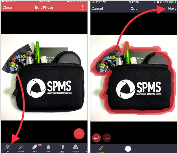
SME – Graphics Apps – Pixomatic removes backgrounds
Marketing Profs has a roundup of the top 10 typography trends of 2018. Arial, Helvetica, and Georgia may remain popular fonts, but you know you have other options. Admittedly, I’m not wild at the idea of serif fonts becoming a big thing on the web – harder to read. But let’s see. MProfs report says “retro designs are making a comeback” – so if you’re not sure what a ‘retro’ type might be, check out this post and infographic (because it’s better to SEE a font than have it described).
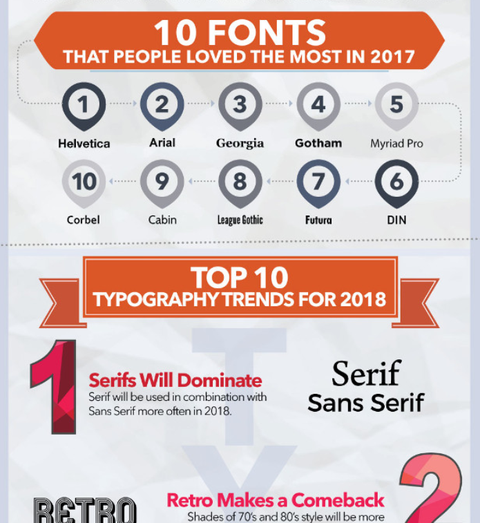
Marketing Pros Typography Trends 2018
Marketing Profs also had a recent post on color theory and impact on brand’s Instagram engagement, with case studies from the world of fashion. Interesting to see real data from 200,000+ posts that shows how images with certain colors perform better.
I’ve been a fan/follower of John Jantsch, of DuctTape Marketing fame, for years and have at least 3 of his books on my shelf next to my desk. I like his clear explanation of visual brand identity:
“involves all the moving pieces that together represent how your brand is perceived…”
So, yeah, your website, logo, business cards, letter head, your brochures; but also if colors of your social posts are consistent, your social media headers, whether you use the same fonts in your social graphics as on your website, as in your documents; do your colors and fonts match the personality of your organization AND your core audience, etc. etc. Keep your touch points consistent.
Time to Practice Your Improving Graphics Skills
HubSpot highlights 10 projects to improve your design skills, because they get that good, aesthetically appealing design is a big part of all aspects of marketing. You don’t have to be a pro designer, but you probably should have a “baseline knowledge” of various marketing topics – I’d say design is a key one. HubSpot partnered with Adobe Spark Post to create these tips, offer workshops, and the 10 projects.
Possible Projects to Practice Your Improving Design Skills On:
- Write and design an infographic [oh hey look at that! More reason to show up March 8th at 1pm ET to see tools to make that easy]
- Create a set of 10 social shareable images – 10 images all to use in one campaign (think variations, iterations)
- Design a week of Instagram posts – cool text + pic options
- Does your library or org have a brand style guide? Opportunity to create a brand starter kit: color palette, preferred typography, visual guidelines.
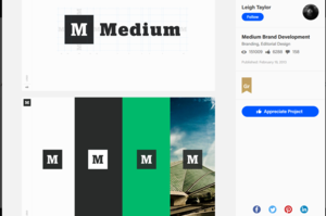
Medium’s Branding Kit shared on Behance
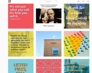
HubSpot’s Instagram uses template styles
Add these tips and tools to your design kit – as well as tools I’ve reviewed and mentioned on my recommended marketing tools page. Have a favorite design inspiration to share? What’s your favorite free font? Let me know on social media!