Attention Library Pals – Don’t Make Another Infographic Until You Read This

Why You Should Use Infographics to Tell Your Library’s Stories in Marketing
Because numbers and stats are dry, boring, and readers skip right over them. . But a visual story told through numbers and facts, that relate to your audience, that’s powerful. You already have tons of data from your library, now make it work better in your marketing by turning it into story with more infographics.
We humans are visual creatures, even if we aren’t all primarily visual learners – we do retain info presented in visual format better than text alone. (if you add a picture to information, readers will retain 65% of it up to 3 days later, vs. only 10% for something they heard)
What IS an “Infographic?”
An infographic is a visual or graphical representation of data, statistics, or key facts that can help a reader more easily visualize a concept, topic, or story that is difficult to understand.
They’re a carefully created, visually appealing, uncluttered blend of graphics and minimal text that turn numbers into stories. Infographics should have a singular focus and show only 1 story at a time. They’re perfect for describing complex relationships or contexts in less space and time than a text-based article. The graphics use space, images, lines or arrows to create a sense of movement and lead the viewer/reader through your numbers or concepts to get to a specific point. In that way they are much more than a bar chart, pie chart, or other graph.
Infographics are NOT a fad (though the various design styles will change depending on what’s popular) and they’ve been around quite a while. Think about how long ago the newspaper USA Today set itself apart with its colorful look, short text, and those quick-to-read little infographics on the corner of every sections’ front page. It’s just we have more, and easier to use, tools to create them now.
Creating a compelling, interesting, appealing infographic no longer requires years of graphic design study, hiring a graphic designer, or learning complicated programs like Illustrator.
Tips on How to Make a Better Looking, More Effective Library Marketing Infographic
- Contrast is key – not just between colors, but of weights, heights, textures, patterns, sizes

Center Duck Offers Visual Contrast Example – O’Reilly Media, Josh Marsh
- Symmetry is powerful and calming – the human eye and brain are attuned to symmetry

Symmetry – from Learning Design Principles.com

- Know where you want to attract and draw your reader’s to focus – use color, elements, icons, even arrows to draw them there.
- White space is good – don’t fill up your paper, screen, cover – whatever you’re designing on
- Repetition can help tie elements together, as well as emphasize areas of focus
- Pay attention to color – it creates harmony, sets a mood, and gives your work a foundation
- Limit your types faces – more makes a mess, harder to read, and loses your point
- Typefaces have personality – pick the right ones for your brand’s personality and the tone and intent of the piece designed (e.g. friendly, round-edges vs. strong, geometrics vs. elegant, light scripts
Want more help? Even if you aren’t using Canva, I recommend their Design School tutorials and tips or their additional design courses.
Ok, you’ve likely already created quite a few infographics, but have you used them for purely marketing purposes?
Rethink infographics and what they can be doing for your library communications efforts. (Remember my PR pal and our webinar? She said it’s crucial to always have a fact sheet about your library on hand to send to the media, community members, or key influencers. AND she said a nice looking infographic would be a much more powerful fact sheet. So there’s homework assignment #1!)
How Can Your Library Use Infographics in Marketing?
Telling the library’s story, importance and continued relevance, to your community is key, we know. Visual, such as infographics can better tell a narrative and make that case.
Present usage statistics to key stakeholders, funding sources, and your community
Show – don’t just tell – your library’s users about important new services, programs, or materials
Tell – and show – the story of how your college/university’s librarians are working with students or researchers [I hate linking to Elsevier. Ugh. But they do have a good infographic example showing how research office and library worked together, shared at an SLA conference]
Show unexpected results or benefits of using your library’s services
Need to communicate value to others in your academic community?
Infographics of hours librarians spent teaching, leading instruction, number of research methods classes, library instruction programs by department, and more.
Wouldn’t an infographic of reference questions asked and answered be more interesting to look at and share than just numbers?
Put key library stats in an infographic and include it in your Press Kit and on your Media page – make it easy for local media to pick up on highlights of library use.
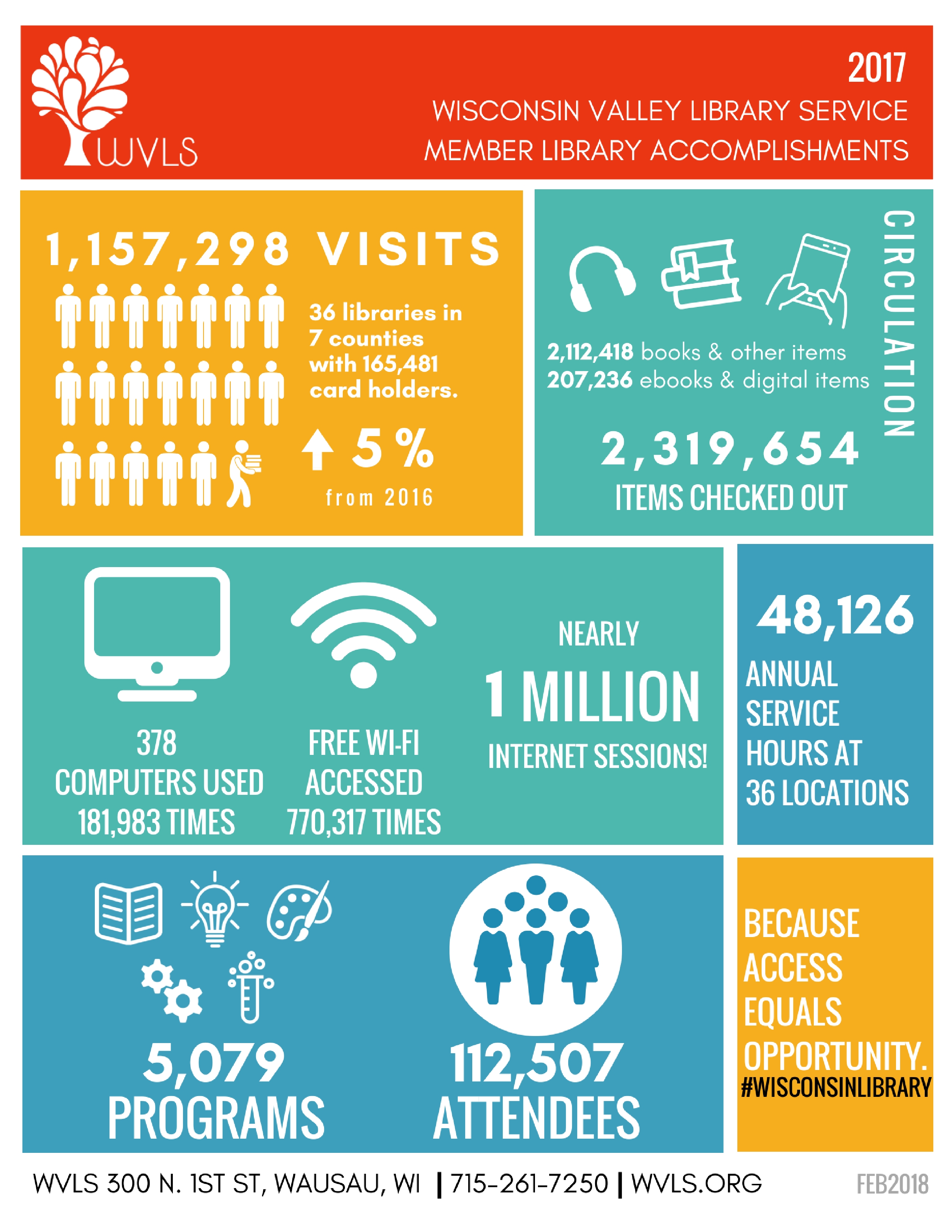
Wisconsin Valley Library Service – library accomplishments
Make a more compelling, easy to understand case for a weeding project by showing the age of your collection, its gaps and deficiencies, via an infographic.
Check out this example from Beach High School Media Center, created and shared in Easel.ly
Illustrate the reasons given for challenging particular books in an infographic and share during Banned Books Week (like this beautiful example from the Comic Book Legal Defense Fund, using Visual.ly).
Annual reports – a narrative chart or graphic can sum up the library’s year better than a lot of text and boring old-school charts

CityTownInfo – Library as Adaptive Success
Courtesy of: CityTownInfo.com
Want to see more examples of infographics from various libraries? Ok!
A curated collection of well-designed, library specific infographics, from Librarian Design Share
Industry outlook for the field of library and information science from the University of Southern California, in excellent infographic form
Other library oriented infographic examples at Ebook Friendly blog
Seeing is Learning – the Basics of a Great Infographic
AASL created an infographic and fact sheet to advocate how ‘Strong School Libraries Build Strong Students’ – any school library can use.
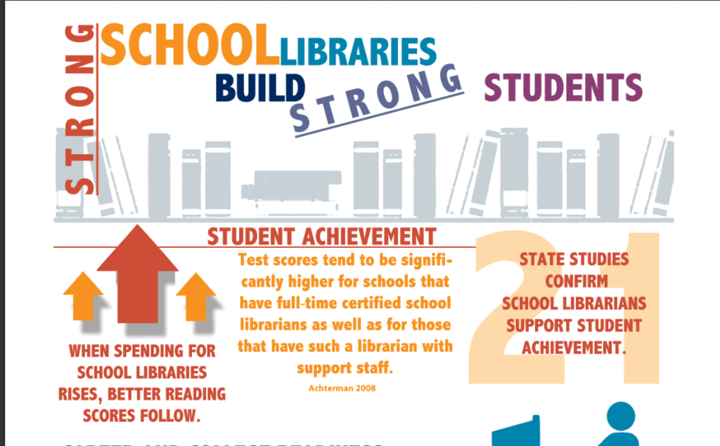
Snippet of AASL strong school libraries advocacy infographic
Infographics Tools I Recommend
Canva – making design easy and affordable. My personal favorite graphics tool – I upgraded to a paid Canva for Work account and don’t regret it! You can use templates and infographic elements in their library, as well as nearly every other design project you could image, many under the free version.
Piktochart – A source for great visuals/infographics without much effort or searching for a graphic designer. I like their drag-n-drop editor and the templates for infographics, presentations, printed collateral (better flyers!), and more. To download as print-quality or PDFs need the pricier, $29/month plan; however educational and nonprofit discounts plans available.
Easel.ly – Has the most affordable pro plan if you want to upgrade from their free offering for creating good-looking infographics, charts, timelines, process charts. You can start from templates or from scratch. Discounts available educators and nonprofits, plus it has won an award from the AASL (American Association of School Librarians) for ease of use by students. Yay!
Visme.co – Create infographics, visual resumes, presentations, as well as graphics that are interactive for websites. Free plan has limited access to their ‘data widgets’, which easily turn stats to gorgeous graphs. Discounts available for nonprofits and educators.
Venngage – Use their easily configurable, pre-made templates for simple visual elements like bubble charts, tree maps, other simple shapes to add to a blog post, social graphic, or a flyer.
![]() Infogr.am – Another option to create infographics, charts, maps and more. It might handle charts better than some of the other options, BUT it’s frustrating you can’t get rid of their watermark to add your own logo until their $67/month plans or higher.
Infogr.am – Another option to create infographics, charts, maps and more. It might handle charts better than some of the other options, BUT it’s frustrating you can’t get rid of their watermark to add your own logo until their $67/month plans or higher.
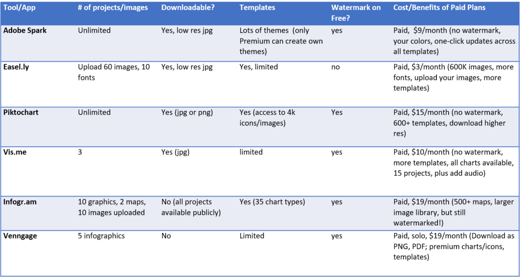
Here’s my pricing comparison chart on several of these tools, from my
Tech Tools & Hacks column for InfoToday’s MLS Newsletter.
Check out my review snippets and recommendations for other marketing tools
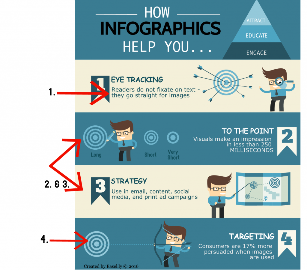
And finally … an infographic about the importance of …. Infographics.
Infographic about importance of infographics – from another tool to create infographics
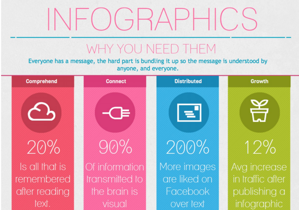
How meta – an infographic about infographics, from Visual.ly
I demonstrate marketing tools like the ones mentioned in this article in my FREE monthly Marketing Tool Talk webinars. Are you getting YOUR invites? Sign up to make sure you do.
Stay on Top of Hot Tools in Less Than 60 Minutes a Month
Want to avoid common marketing mistakes and headaches? Learn the top tools - without doing all the research?
You CAN with the FREE monthly Marketing Tool Talk webinar.
Information in this post previously appeared in these articles:
“Making Effective Infographics” – my Tech Tools and Hacks column, Nov/Dec 2017 Marketing Library Services Newsletter from InfoToday [article not available for free; check where MLS is indexed]
“Design Tips and Hacks for Non-Designers” – my Tech Tools and Hacks column, Jan/Feb 2018 Marketing Library Services Newsletter from InfoToday [article not available for free; check where MLS is indexed]
“Infographics for Info Pros”, article in Jan/Feb 2018 issue Online Searcher magazine, from InfoToday [UPDATE: As of late April 2018 – article IS NOW available for free]